

Balance Freedom & Control In Watercolor
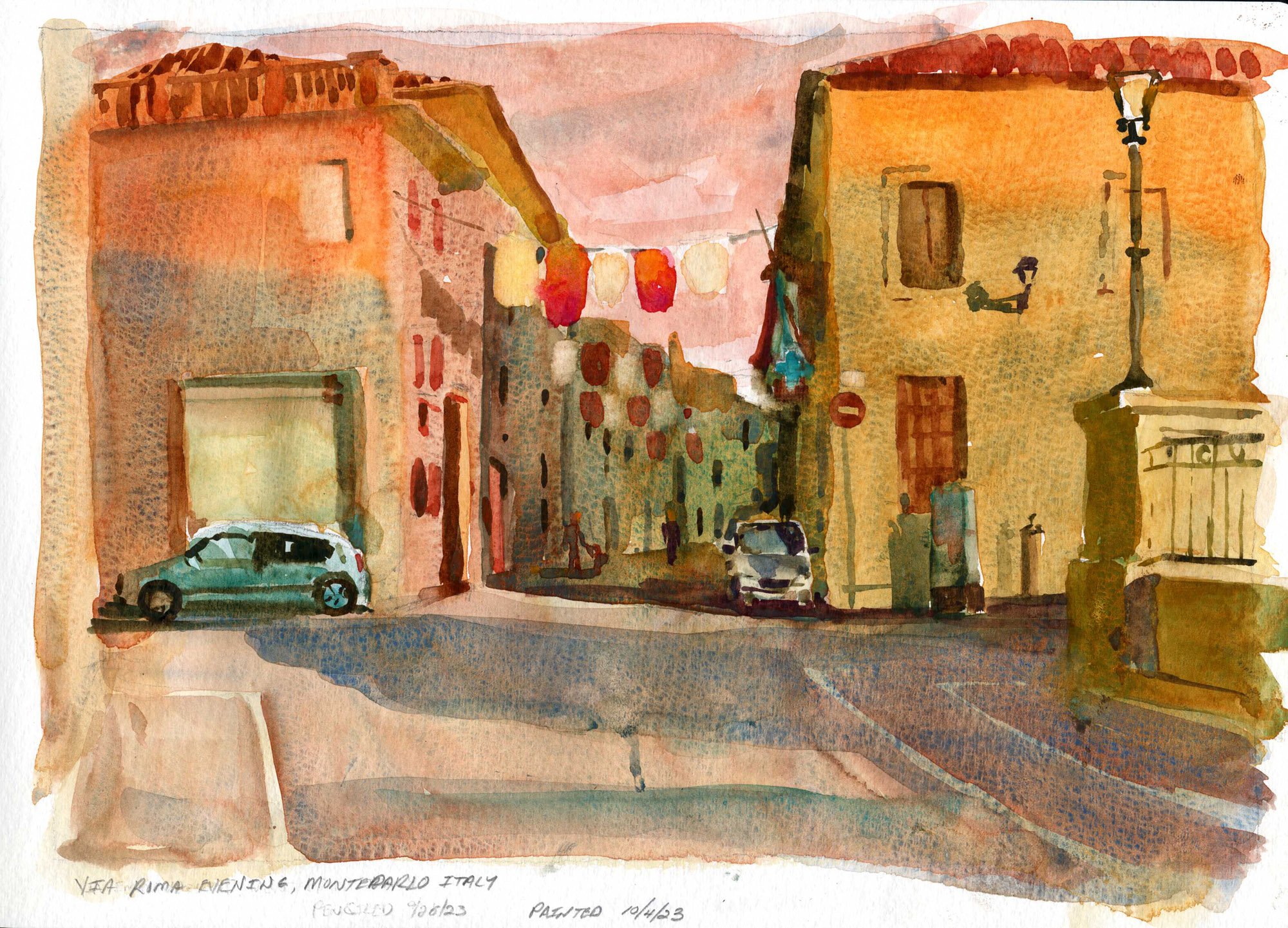
Watercolor Retreat - September 19-26, 2025 - Hotel Leone, Montelparo, Le Marche, Italy.
This is a blog for the our workshop group. I’ll post info for the group here and in replies. It is an open, public blog post - feel free to post questions, comments, etc as you need.
IMPORTANT INFO DOWNLOADS
DOWNLOAD RETREAT SCHEDULE AND ITINERARY
PACKING PAINTING SUPPLIES FOR TRAVEL - MY RECOMMENDATIONS AND APPROACH
SHIPPING MATERIALS TO THE HOTEL
You can ship materials to the hotel rather than pack them in your luggage. Shipping address is below.
In the hotel's experience, DHL seems to be the most used service for deliveries. NOTE : An import tax is sometimes charged on shipments that include art supplies.
If you choose to ship, please include my name on the shipment so that the hotel can store and organize the shipments correctly.
SHIPPING MATERIAL HOME AT THE END OF THE WORKSHOP
SendMyBag.com is the company we recommend for sending things home after your week with us.
Alternatively, the larger courier companies, such as DHL, offer a pick up and delivery service. You are individually responsible for making return shipping arrangements.
ORDERING MATERIALS
As an alternative to shipping, you can order supplies and have them delivered to the hotel. There are two recommended choices
Amazon Italy - https://www.amazon.it
Hotel Leone - the hotel has an online shop with some watercolor supplies - https://hotelleonemarche.com/en/product-category/art-supplies/
I look forward to seeing you in Italy in September!
LARGE SHEETS OF PAPER AVAILABLE ON HOTEL WEBSITE
I recommend the Bockinford paper - 140lb weight (300 gsm) with a rough surface the sheets are about 11" x 14" - a good size for this workshop. Click here for the product page.
PARKING AT THE HOTEL
Sheila and Darius : I've let the hotel know that you will meet the group at Ancona airport and follow the van back to the hotel in your rental car.
"We do have a couple of parking spaces at the hotel carpark that are they are available on a first-come, first-served basis. In the event those are already taken, there is a free public parking available just a 2-minute walk away from the hotel that's safe in a tranquil town like ours."
RECOMMENDED MATERIALS & PAINT COLORS
The recommended list is just that : recommended. Don’t feel the need to run out and buy everything on the list. Bring what you have and what you are comfortable with.
I’ll encourage you to work on larger sheets of paper as the week goes along. For me, it’ll be quarter-sheets : 11” x 15” for the most part. The hotel has Bockingford paper for sale on their website. It’s 140lb weight (300 gsm) with a rough surface the sheets are about 11" x 14" - a good size for this workshop. Click here to purchase from the hotel
Any supplies you order from the hotel website will be ready for pick up during the retreat.
LARGE brushes are recommended as well : Large rounds greater than #16 in size are best along with 1 1/2” or 2” Flats. I’ll have a few extras with me to share.
PAINT COLORS : Of all the ones on the recommended list, there are three that I use frequently but are not on most folks palettes - they are listed below:
CERULEAN BLUE - There are two different versions of Cerulean Blue offered by paint manufacturers - learn the differences here. I prefer the Cobalt Stannate version, identifiable through it’s pigment code PB35. It is the older, more traditional version. I like it for its blue-green hue and distinctive granularity. My choice is the Winsor-Newton version.
QUINACRIDONE DEEP GOLD - Like all Quinacridone this is a hue with high color strength and intensity although it is a neutralized warm yellow. It mixes well with blues for a variety of interesting greens. It is very transparent and is great as a glaze to bring life to dull, muddy passages. I prefer the Daniel Smith version.
QUINACRIDONE BURNT SCARLET - Another Quinacridone color with characteristic transparency and color strength. It mixes well with blues for neutral violets that are great substitutes for grayer neutrals. This makes it a great color for winter scenes, providing colorful neutrals to bleak landscapes. It is also a good base color for brick buildings. I prefer the Daniel Smith version.