
The Golden Hour : Light On The Landscape
Class Page
Morning Session
Mondays - 9am to 11am - August 3, 10, 17, 24
Evening Session
Mondays - 6pm to 8pm - August 3, 10, 17, 24
Week 1
-
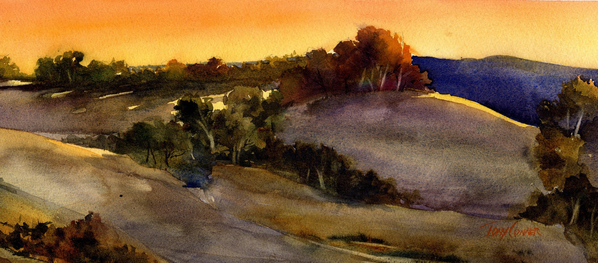
The Golden Hour happens twice a day - shortly after sunrise and shortly before sunset. Despite its name, it does not usually last an entire hour. During these two periods, sunlight is softer, warmer, and less harsh compared to midday light. Contrast is reduced and shadows are long.
The effect is principally due to two things : lightwaves passing through thicker atmosphere scatters the shorter violet and blue light wavelengths making them less visible; and the lower atmosphere is activated with the remaining warm light - in effect creating a massive source of ambient light that illuminates the landscape from multiple angles all at once.
The most challenging aspect of capturing golden hour light is the shift toward warm intense hues, even on elements that otherwise have a cool hue as their local color. Classes, pre-class work and critiques will primarily focus on three things:
•Managing chroma/intensity
•Relative temperature contrasts/shifts
•Warming cool hues while maintaining the character of the local color
More info on these topics and more in the Week 1 Class Info Sheet
-
PAINT - This class is all about the ‘golden hour’ landscape . There is one color scheme that works well for this type of scene. We’ll use various combinations of common paint colors for the in-class paint projects. All will be chosen from the paint colors listed below. Don’t feel the need to run out and buy colors that are not on your palette since there is always another that can be used as an alternative.
Blues : Ultramarine Blue, Cobalt Blue, Cerulean Blue, Indanthrene Blue
Reds : Cadmium Red (Light), Permanent Alizarin Crimson, Quinacridone Burnt Scarlet
Yellows : Aureolin Yellow, Cadmium Yellow (Light), Indian Yellow
Neutrals And Earth Colors : Burnt Sienna, Raw Sienna, Burnt Umber
BRUSHES - We’ll use a variety of round and flat brushes for the in-class paintings. Recommended are:
Flats : 1 ½” or 2”, 1”, ½”, ¼”
Rounds : Large (#18 or larger), Medium (#12 or #14), Small (#6 or #8), X Small (#2 or #4) and a Rigger
PAPER - Have a supply of PROFESSIONAL grade 140lb Cold Press Watercolor Paper available for both In-Class paintings and Pre-Class ‘homework’ projects. Watercolor paper is not the same brand to brand. I prefer papers that have more absorbency to help manage fluid washes. I recommend Saunders-Waterford 140lb Cold Press for this reason. But, work on any surface you prefer.
-
There is no critique this week.
The four scheduled critiques for this class are :
Prior to Week 2 Class : critique work due Saturday, August 8 by 6PM US Eastern Time
Prior to Week 3 Class : critique work due Saturday, August 15 by 6PM US Eastern Time
Prior to Week 4 Class : critique work due Saturday, August 22 by 6PM US Eastern Time
AFTER Week 4 Class : critique work due Saturday, August 29 by 6PM US Eastern Time
-
We’ll go over some of the important areas of attention in the sample painting on page 1 and discuss our methods and approach for the actual painting.
Then we’ll paint a version of the page 1 scene. The drawing layout is on the last page of the class info sheet. The blue lines mark the edges of cast shadows.
The color palette for this week:
ANALOGOUS WARMS - Permanent Alizarin Crimson, Cadmium Red, Raw Sienna, Burnt Sienna
COOL COMPLEMENT - Ultramarine Blue
Week 2
DOWNLOADS
CLASS INFO SHEET
FINISHED IN-CLASS PAINTING DEMOS
-
THE LANDSCAPE AS INTERCONNECTED PLANES
Landscape scenes depicted in drawings and paintings consist of multiple two-dimensional planes that represent the elements of, and three-dimensional space represented in the scene.
Roughly speaking, a landscape picture plane is often divided in two by an edge that represents the separation of land from sky. In some scenes, this is the actual horizon line. More often, the horizon line is obscured by other landscape elements like hills, mountains, tree lines and buildings. The single, connected line that marks the top edge of these elements is the separation marker.
The large plane below the separation marker represents everything below is the major ground plane. In most cases, the major ground plane is further divided into sub-planes that represent individual elements of the landscape. Size, shape, and placement of these sub-planes has much to do with representation of individual elements, space and distance, and the success of the composition.
SUB-PLANES
Look at the painting on the prior page. There are many sub-planes within the major ground plane. Some of them represent fields which are more-or-less horizontal planes. Others represent tree lines, hills and mountains - all more-or-less vertical planes.
Each sub-plane is both separate and connected to adjacent planes.
How are they separated?
How are they connected?
What conventions are used to represent form, slope, movement, and contour?
-
Look through your paintings for an expansive landscape scene - one that includes a great deal of distance. Or, use the image from Week 1 class.
Re-draw the scene on tracing paper making clear separations between the three planes of space - fore-ground, middle ground, background.
Paint a new version of the same scene as an early spring landscape with the same limited, low-intensity palette from the week 1 in-class project : Ultramarine Blue, Cobalt Blue, Raw Sienna, Burnt Sienna, Quinacridone Burnt Scarlet.
Use a value arrangement similar to the in-class project with the foreground plane the darkest, mid-ground plane mid-value, background plane with the lightest values.
-
Email an image of your finished pre-class painting for critique by 6pm Saturday, April 18.
It will help me if you label your image with your name, i. e , Conner1.jpg
-
We’ll review the sample painting from page 1, discussing it’s plane and sub-plane structure and how the five ideas for representing space and distance (from Week 1 Class Info Sheet) are used in this painting.
Next, we'll paint another version of the same scene but as a summer landscape. This will allow us to use a limited, low-intensity palette that works for this season but also requires a focus on value relationships.
The value composition for the inclass painting is on the next page. The drawing layout is on the last page.
Paint Colors for class painting:
Ultramarine Blue
Aureolin Yellow
Cadmium Yellow
Raw Sienna
Quinacridone Burnt Scarlet
Week 3
DOWNLOADS
CLASS INFO SHEET
FINISHED IN-CLASS DEMOS
-
The landscape is a very popular subject for artists as well as very approachable subjects that are appreciated by almost everyone.
This class focuses on getting landscape paintings to ‘look right’ and will cover specific elements of the landscape along with ideas that create the sense of space, distance and dimension.
THE ILLUSION OF SPACE AND DISTANCE
Landscape paintings are two-dimensional representations of three-dimensional scenes. Since our paper doesn’t have that critical third dimension to work with, our work must provide other visual cues for the viewer to make sense of space, distance and the relationships between different objects. This is a visual illusion. The illusion is developed by including five simple considerations.
Planes Of Space
Vertical dimension
Scale
Overlaps
Aerial Perspective
PLANES OF SPACE
This should be your first consideration! We’ll employ a very simple method of dividing the picture plane into shapes that represent areas of three-dimensional space – foreground, middle-ground and background. This simplification makes it easier to compose the painting. It also helps clarify space in a way that makes it easier to apply the other four considerations.
Consider this typical country scene.
The drawing maps out the shapes of the objects in the picture.
The places where two objects meet forms the edge boundary between two objects.
Some of these boundaries can perform the additional role of separating planes of space.
In this scene, it is easy to separate three planes of space. The images below illustrate the idea with each plane of space overlaid with gray.
Foreground Middle-Ground Background
Notice that each plane of space is a different size and occupies a different amount of the picture plane. Although it is not the primary focus of this lesson it is an important design idea that helps strengthen a composition.
More importantly, notice that this division sets up a hierarchy of space that will guide the use of the other four considerations. Let’s consider each individually.
Vertical Dimension
Notice that the bottom edge or bottom-most points for objects in the foreground are closer to the bottom edge of the picture plane than any in either the middle ground or background. Likewise, middleground objects are nearer the bottom edge than anything in the background.
There is one obvious exception to the statement above. The uppermost parts and edges of the foreground barn are vertically higher than anything in either the mid-ground or background.
This is because the vertical dimension serves two purposes in a representational painting :
one is to represent relative height
the other is to represent the missing third dimension - depth.
So, as a general rule, the more distant the object, the higher it will be in vertical space, or in the vertical dimension.
The sky is an important exception! On the two-dimensional picture plane, the sky is represented by a 2D plane that we sense as a vertical plane. Dimensionally speaking, it is a horizontal plane, parallel to the ground plane. Objects that might occupy the sky - clouds, birds, and flying machines - are nearer the top edge of the paper when they are closest, and lower in vertical dimension the farther away they are.
Scale
Scale is simply the size difference between objects that are closer to the viewer versus those that are further away. Objects that are farther away are smaller than those that are closer.
In this scene, the barn buildings in the foreground are larger than similar barn buildings in the middle ground. The same holds true for tree shapes from foreground to mid-ground to distant mid-ground.
Overlap
It’s probably obvious, but important to keep in mind, objects that are closer to us will very likely overlap things that are farther away.
Overlaps occur when one shape partially covers another. A visual perception of space is created when one object appears to be closer than the one that is being overlapped. Overlaps are related to scale in that an object nearer to the viewer is also larger, taking up more space and therefore, more likely to overlap objects that are farther away.
Continuation is another idea related to overlaps that is also important. Sometimes, one object overlaps only part of another. This is essentially a partial overlap, where a line that represents the edge of one object is interrupted by another object. meaning that the shape of the distant object seems to disappear behind the closer object and then reappear on the other side – a Continuation, in other words.
Continuations are especially important in the initial drawing because they confirm and reinforce the Overlap.
The edge boundary may represent a true, physical edge between objects – the edge of a field and a tree line, the edge of a road and an adjacent field, etc. More often, the edge boundary represents an overlap. This occurs when the edges meet in 2D but represent the overlap of two objects that exist in different planes of space.
Aerial Perspective
The effect known as aerial perspective is another important method of creating a sense of space and distance on a two-dimensional picture plane.
Generally speaking, objects that are farther away are lighter, grayer, and softer edged. Nearer objects are darker, brighter and their edges tend to be harder
Note that there are three effects listed above : one effect is on VALUE (darker/lighter), CHROMA (brighter/grayer) and one on EDGE CONDITION (hard/soft). It’s important to know that applying only two of the three is generally enough to create the illusion.
-
PAINT - We’ll be painting a variety of landscape scenes as they might appear in all four seasons. The color schemes for depicting these seasons can be managed with the set of common paint colors listed below. Don’t feel the need to run out and buy colors that are not on your palette since there is always another that can be used as an alternative.
Blues : Ultramarine Blue, Cobalt Blue, Cerulean Blue, Indanthrene Blue
Reds : Cadmium Red (Light), Permanent Alizarin Crimson, Quinacridone Burnt Scarlet
Yellows : Aureolin Yellow, Cadmium Yellow (Light), Indian Yellow
Neutrals And Earth Colors : Burnt Sienna, Raw Sienna, Burnt Umber
BRUSHES - We’ll use a variety of round and flat brushes for the in-class paintings. Recommended are:
Flats : 1 ½” or 2”, 1”, ½”, ¼”
Rounds : Large (#18 or larger), Medium (#12 or #14), Small (#6 or #8), X Small (#2 or #4) and a Rigger
PAPER - Have a supply of PROFESSIONAL grade 140lb Cold Press Watercolor Paper available for both In-Class paintings and Pre-Class ‘homework’ projects. Watercolor paper is not the same brand to brand. I prefer papers that have more absorbency to help manage fluid washes. I recommend Saunders-Waterford 140lb Cold Press for this reason. But, work on any surface you prefer.
OTHER SUPPLIES - In addition to your regular watercolor supplies, two other things are recommended for class.
Tracing paper
Value scale - nine or ten steps with holes in the middle. Use a commercial version or make one of your own. Video tutorials for making your own 5 as well as 9 step scale can be found here.
Both will be a help in making it easier to apply the ideas covered in class by modifying some of your own paintings and compositions.
-
There is no critique this week.
The six scheduled critiques for this class are :
Prior to Week 2 Class : critique work due Saturday, April 18 by 6PM US Eastern Time
Prior to Week 3 Class : critique work due Saturday, April 25 by 6PM US Eastern Time
Prior to Week 4 Class : critique work due Saturday, May 2 by 6PM US Eastern Time
Prior to Week 5 Class : critique work due Saturday, May 9 by 6PM US Eastern Time
Prior to Week 6 Class : critique work due Saturday, May 16 by 6PM US Eastern Time
AFTER Week 6 Class : critique work due Saturday, May 23 by 6PM US Eastern Time
-
First is a review of the Class Page.
Next, we’ll review the ways the five considerations presented above apply to the scene on page one.
Finally, we’ll paint a version of the same scene but as an early spring landscape. This will allow us to use a limited, low-intensity palette that works for this season but also requires a focus on value relationships.
The value composition for the in class painting is on the next page. The drawing layout is on the last page.
Paint Colors for class painting:
Ultramarine Blue
Cobalt Blue
Raw Sienna
Burnt Sienna
Quinacridone Burnt Scarlet
Week 4
DOWNLOADS
CLASS INFO SHEET
FINISHED IN-CLASS PAINTING DEMOS
-
THE LANDSCAPE AS INTERCONNECTED PLANES
Landscape scenes depicted in drawings and paintings consist of multiple two-dimensional planes that represent the elements of, and three-dimensional space represented in the scene.
Roughly speaking, a landscape picture plane is often divided in two by an edge that represents the separation of land from sky. In some scenes, this is the actual horizon line. More often, the horizon line is obscured by other landscape elements like hills, mountains, tree lines and buildings. The single, connected line that marks the top edge of these elements is the separation marker.
The large plane below the separation marker represents everything below is the major ground plane. In most cases, the major ground plane is further divided into sub-planes that represent individual elements of the landscape. Size, shape, and placement of these sub-planes has much to do with representation of individual elements, space and distance, and the success of the composition.
SUB-PLANES
Look at the painting on the prior page. There are many sub-planes within the major ground plane. Some of them represent fields which are more-or-less horizontal planes. Others represent tree lines, hills and mountains - all more-or-less vertical planes.
Each sub-plane is both separate and connected to adjacent planes.
How are they separated?
How are they connected?
What conventions are used to represent form, slope, movement, and contour?
-
Look through your paintings for an expansive landscape scene - one that includes a great deal of distance. Or, use the image from Week 1 class.
Re-draw the scene on tracing paper making clear separations between the three planes of space - fore-ground, middle ground, background.
Paint a new version of the same scene as an early spring landscape with the same limited, low-intensity palette from the week 1 in-class project : Ultramarine Blue, Cobalt Blue, Raw Sienna, Burnt Sienna, Quinacridone Burnt Scarlet.
Use a value arrangement similar to the in-class project with the foreground plane the darkest, mid-ground plane mid-value, background plane with the lightest values.
-
Email an image of your finished pre-class painting for critique by 6pm Saturday, April 18.
It will help me if you label your image with your name, i. e , Conner1.jpg
-
We’ll review the sample painting from page 1, discussing it’s plane and sub-plane structure and how the five ideas for representing space and distance (from Week 1 Class Info Sheet) are used in this painting.
Next, we'll paint another version of the same scene but as a summer landscape. This will allow us to use a limited, low-intensity palette that works for this season but also requires a focus on value relationships.
The value composition for the inclass painting is on the next page. The drawing layout is on the last page.
Paint Colors for class painting:
Ultramarine Blue
Aureolin Yellow
Cadmium Yellow
Raw Sienna
Quinacridone Burnt Scarlet